
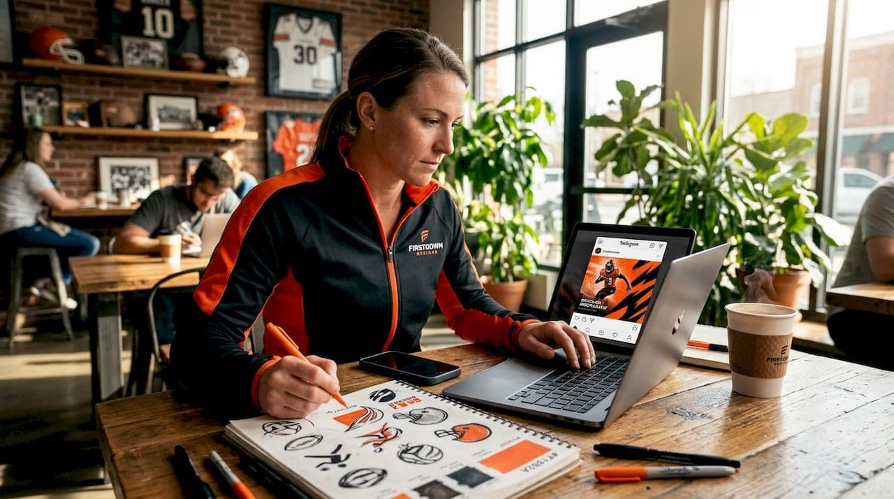
You post consistently. You share game highlights, roster updates, and hype content. Yet your team's Instagram account still feels invisible. The frustration is real, and it is more common than you think. The solution most programs overlook is not more posts. It is better ones. When you grow team Instagram with custom graphics, you stop blending in with every other program posting raw screenshots and generic templates. You build a visual identity that fans recognize, recruits notice, and the algorithm rewards. This guide gives you the exact steps to make that happen.
Table of Contents
- Key Takeaways
- How to grow team Instagram with custom graphics
- Designing graphics that actually stop the scroll
- Coordinating multiple staff without losing brand consistency
- Measuring what is working and adjusting
- My honest take on visual branding for athletic programs
- Take your team's Instagram to the next level
- FAQ
Key Takeaways
| Point | Details |
|---|---|
| Set your brand foundation first | Define team colors, fonts, and logo rules before creating a single graphic. |
| Size your graphics correctly | Use 1080×1080 or 1080×1350 for feed posts and 1080×1920 for Stories to avoid cropping. |
| Design for engagement signals | Saves and shares carry more weight than likes for Instagram's algorithm distribution. |
| Coordinate contributors with templates | Centralized templates prevent off-brand posts when multiple staff or volunteers are creating content. |
| Measure what actually matters | Track hook rate, saves, and shares, then adjust your designs based on what the data tells you. |
How to grow team Instagram with custom graphics
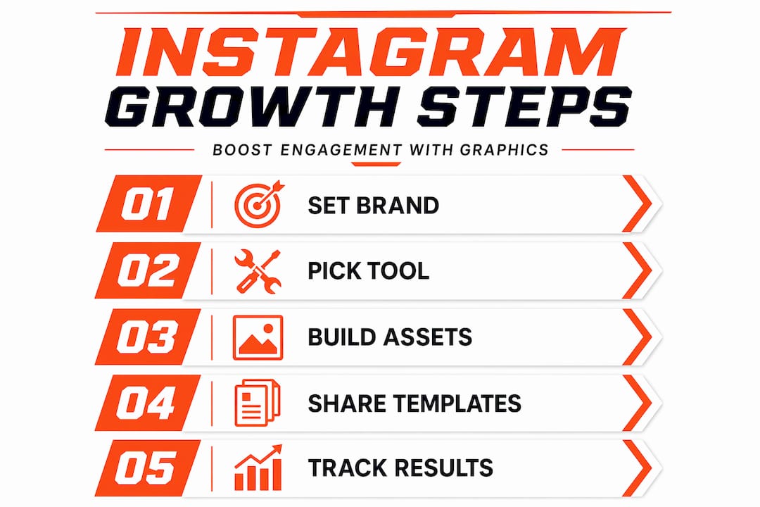
Before you open any design tool, you need a brand foundation. Without it, every graphic your program creates will look slightly different, and that inconsistency quietly kills credibility. Start by locking in three things: your official team colors (with exact hex codes), your primary and secondary fonts, and your logo in multiple file formats including PNG with a transparent background.
Once those are documented, choose your design tool. Canva works well for programs with non-designers on staff because it supports shared team workspaces and drag-and-drop editing. Adobe Express offers more control over typography and layering for coordinators with a little more design experience. Either way, tools like Canva and Slate help teams build reusable branded layouts accessible to multiple users, which matters when your content creation is spread across coaches, managers, and volunteers.
Set up a shared asset library inside your chosen tool. Upload your logo files, team photos, and any approved graphic elements. Then build master templates for your most common post types: game day graphics, score updates, player spotlights, and schedule posts.
Sizing matters more than most programs realize. Feed posts are sharpest at 1080×1080 or 1080×1350, while Stories and Reels require 1080×1920. Uploading at the wrong dimensions forces Instagram to compress or crop your graphic, which makes even a well-designed post look sloppy.
Pro Tip: Create a one-page brand guide PDF and share it with every staff member who posts content. Include hex codes, approved fonts, and a "do not use" section with examples of off-brand graphics. It takes 30 minutes to build and saves hours of corrections later.
| Format | Dimensions | Best use |
|---|---|---|
| Square feed post | 1080×1080 px | Player spotlights, quotes |
| Portrait feed post | 1080×1350 px | Game day graphics, announcements |
| Story / Reel | 1080×1920 px | Behind-the-scenes, score updates |
| Carousel slide | 1080×1080 px | Game recaps, season highlights |
Designing graphics that actually stop the scroll
Having the right setup is half the battle. The other half is knowing what to design and how to design it well. Here is a process that works for athletic programs at every level.
-
Choose your format before you design. Feed posts, Stories, and Reels each serve different purposes. A game-day hype post works best as a portrait feed graphic or a Story. A season recap belongs in a carousel. A player signing announcement can be a single feed post with a strong visual hierarchy. Match the format to the goal, not the other way around.
-
Lead with a hook on every graphic. The first thing a viewer sees needs to stop them from scrolling. For carousels, designing a strong first slide is critical for hooking viewers and encouraging swiping. Use bold typography, high contrast, and a clear focal point. A player's face, a bold score, or a dramatic action shot all work well as anchors.
-
Build branded layouts, not one-off designs. Every graphic should feel like it belongs to the same family. Use consistent placement for your logo, consistent color blocking, and consistent font pairings. This is what separates programs with strong Instagram presence from those that look like they designed each post from scratch.
-
Use carousels for storytelling. A three to five slide carousel showing game highlights, stat lines, and a final score gives fans a reason to swipe and spend more time on your post. More time on post signals value to the algorithm. Carousels also give you a natural structure: hook slide, content slides, and a closing slide with a call to action.
-
Keep hashtags tight. Using only 3 to 5 hashtags per post is the current best practice for organic reach. Use a mix of a branded hashtag specific to your program, a sport-specific tag, and one or two location-based tags. More than five starts to look cluttered and can actually reduce your distribution.
-
Add interactive elements to Stories. Polls, question stickers, and countdown timers on Stories create direct engagement that Instagram treats as a strong signal. A simple "Who's your player of the game?" poll after a win takes 60 seconds to add and generates real interaction from your audience.
Pro Tip: Build a "template kit" with at least five ready-to-use layouts: game day, final score, player spotlight, schedule release, and a general announcement. When something happens fast, like a last-minute win, you want to post in minutes, not hours.
Coordinating multiple staff without losing brand consistency
Most athletic programs are not run by one person. You have assistant coaches, team managers, boosters, and parent volunteers who all want to contribute content. That is a good problem to have, but it creates a real risk: off-brand posts that confuse your audience and dilute the visual identity you are building.
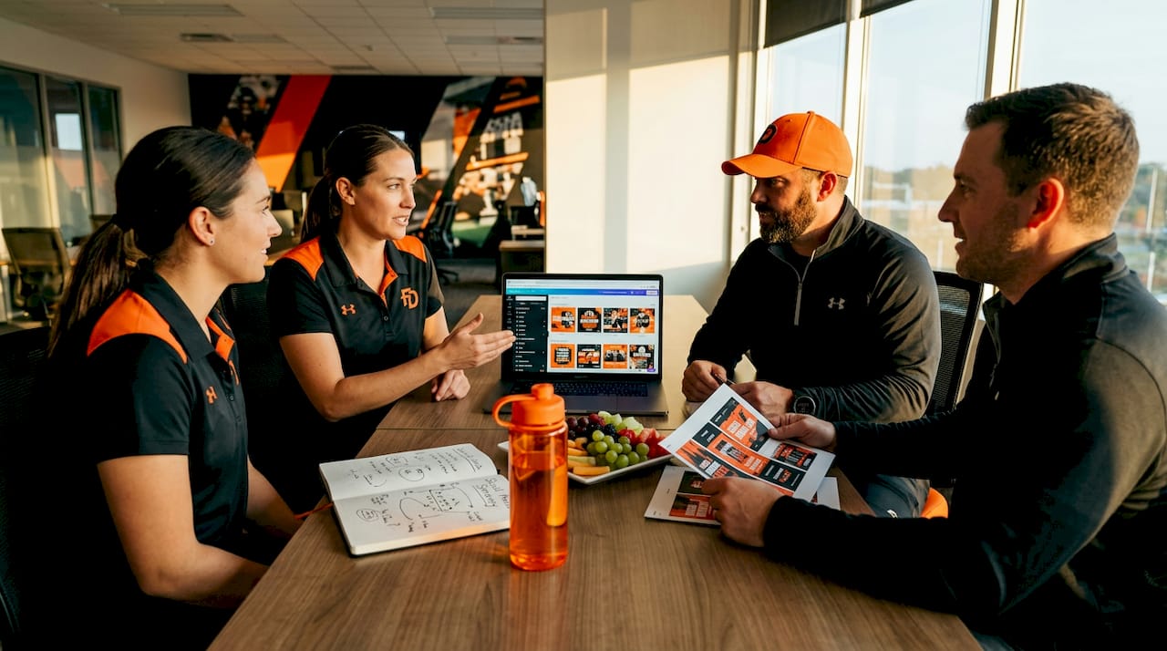
The fix is a centralized system, not stricter rules. When everyone works from the same templates and asset library, brand consistency happens automatically rather than requiring constant oversight.
Here is what a functional workflow looks like for a multi-person team:
- Design phase: The coordinator or designated graphic lead creates or updates master templates each week.
- Customize phase: Staff members fill in approved templates with current content (player names, scores, dates) without altering colors, fonts, or layouts.
- Approval phase: Any non-templated or custom graphic gets a quick review from the coordinator before posting.
- Scheduling phase: Approved graphics are scheduled through a tool like Later or Meta Business Suite to maintain a consistent posting cadence.
Centralized templates and approval workflows keep team content unified even when multiple people are contributing. This is not just about aesthetics. Profiles with cohesive visuals see up to 38% higher engagement compared to those with inconsistent posting styles.
Training staff does not need to be complicated. A 15-minute walkthrough of the template library, a short video recording of the process, and a written reference guide is enough for most contributors to work independently and correctly.
Pro Tip: Define "safe zones" inside every template. These are locked areas where your logo, team name, and key stats always appear. When staff customize the template, they only edit the designated text and image fields. This prevents accidental cropping or logo placement issues across different post formats.
| Approach | Consistency level | Time investment |
|---|---|---|
| No templates, everyone designs freely | Low | High (constant corrections) |
| Shared templates, no approval process | Medium | Low (but risk of drift) |
| Shared templates plus approval workflow | High | Low to medium |
| Fully outsourced to a design service | Highest | Minimal for staff |
Measuring what is working and adjusting
Posting great graphics is not enough. You need to know which ones are actually moving the needle and why. Instagram Insights gives you the data. The challenge is knowing which numbers to focus on.
For Reels, the metric that predicts reach better than anything else is hook rate. A hook rate above 50% on short Reels under 15 seconds signals strong distribution potential. Hook rate is calculated by dividing three-second views by total impressions. If your hook rate is low, your opening graphic or first frame is not compelling enough to stop the scroll.
For feed posts and carousels, focus on saves and shares rather than likes. Shares via DMs and saves are stronger engagement signals for algorithm distribution than likes alone. A graphic that gets saved is a graphic someone found genuinely useful or meaningful. That is the kind of content that builds a loyal audience.
Run a monthly audit using these checkpoints:
- Are your top five posts by saves and shares visually consistent with your brand?
- Which post format (single image, carousel, Reel) is generating the most profile visits?
- Are posts with custom graphics outperforming posts without them?
- What time of day are your most engaged followers active?
Use the answers to refine your template designs and posting schedule. If your player spotlight carousels consistently outperform your game-day single images, make more carousels. If your Reels are getting high impressions but low hook rates, redesign the opening frame to be more visually arresting.
| Metric | What it measures | Target benchmark |
|---|---|---|
| Hook rate | First 3-second retention on Reels | 50%+ for short Reels |
| Save rate | Content value and reference potential | Above platform average |
| Share rate | Audience advocacy and reach extension | Trending upward month over month |
| Profile visits from posts | Conversion from content to follower | Consistent with posting frequency |
My honest take on visual branding for athletic programs
I have worked with programs that post every single day and still wonder why their following is flat. And I have seen programs that post three times a week with sharp, consistent graphics and watch their engagement climb steadily. The difference is almost never frequency. It is almost always visual identity.
What I have learned is that most programs underestimate how much visual consistency matters to the people watching. Fans, recruits, and parents are not consciously critiquing your design choices. But they are absolutely registering whether your account looks like a credible, organized program or a collection of random posts. That subconscious impression shapes whether they follow, share, and come back.
The hardest part is not the design itself. It is coordinating non-designers who are also coaches, managers, and volunteers with limited time. Templates solve this problem better than any training session ever will. When the system is built correctly, contributors cannot easily post something off-brand even if they try.
One thing I push hard on with programs I work with: stop treating graphics as decoration and start treating them as communication. Your graphic is not just a pretty frame around a player photo. It is telling your audience who you are, what you value, and whether they should pay attention. That reframe changes everything about how you approach design decisions.
The programs that grow fastest are the ones that commit to a system, measure what is working, and iterate consistently. Not perfectly. Consistently.
— Aaron
Take your team's Instagram to the next level
If building and managing a full custom graphics system sounds like more than your staff can take on right now, that is exactly the problem F1rstdown was built to solve.
F1rstdown creates fully custom, bespoke graphics for athletic programs with a one-day turnaround and a direct 1:1 relationship with a professional designer. No generic templates. No back-and-forth with a faceless service. Programs like MNU Men's Basketball and Cathedral HS Football have used F1rstdown to build the kind of consistent, high-quality Instagram presence that attracts recruits and engages fans. Explore the monthly graphics subscription to keep your content fresh every week, or browse the full range of custom design services to find the right fit for your program.
FAQ
How often should a team post custom graphics on Instagram?
Three to five times per week is a sustainable cadence for most athletic programs. Consistency matters more than volume, so a regular schedule of high-quality custom graphics will outperform daily posting with inconsistent visuals.
What Instagram size should team graphics be?
Feed posts perform best at 1080×1080 or 1080×1350 pixels, and Stories or Reels should be 1080×1920 pixels. Using these exact dimensions prevents cropping and keeps your graphics sharp on every device.
Do custom graphics really increase Instagram engagement?
Yes. Consistent branded visuals can increase engagement by up to 38% compared to profiles with inconsistent aesthetics. Custom graphics signal professionalism and make your content immediately recognizable to your audience.
How many hashtags should a team use per Instagram post?
Stick to 3 to 5 hashtags per post. More than five hashtags can reduce your reach according to current Instagram best practices. Use a branded program hashtag, a sport-specific tag, and one or two location tags for the best results.
What metrics should coaches track to measure Instagram growth?
Focus on hook rate for Reels, saves and shares for feed posts, and profile visits generated from individual posts. These signals reflect genuine audience interest and predict algorithmic distribution far better than like counts alone.