

Most marketers know visuals perform better than text posts. Far fewer understand why at a neurological level, and that gap costs them real engagement. The phenomenon has a name in cognitive science: the picture superiority effect. It describes how the brain processes and retains images far more efficiently than written words. Understanding why visual content outperforms text posts, and not just accepting it as a trend, changes how you plan, design, and prioritize every piece of content you publish. This article breaks down the science, the platform data, and the practical strategy so you can apply it immediately.
Table of Contents
- Key takeaways
- Why visual content outperforms text posts: the cognitive science
- Engagement numbers that prove the point
- How to balance visuals and text for maximum impact
- When visuals alone are not enough
- Putting it all together
- My take on visuals after years in the field
- Take your visual content to the next level
- FAQ
Key takeaways
| Point | Details |
|---|---|
| Visuals process faster | The brain handles images through perceptual shortcuts that written text simply cannot match. |
| Engagement gap is massive | Visual posts generate up to 650% more engagement than text-only content across social platforms. |
| Format must match platform | Instagram, LinkedIn, and TikTok each reward different visual styles, so one-size-fits-all design fails. |
| Text still plays a role | Concise copy paired with strong visuals outperforms either element alone when used strategically. |
| Overdesign hurts performance | Too many visuals or unrelated graphics add cognitive load and reduce comprehension. |
Why visual content outperforms text posts: the cognitive science
The gap between visual and text performance is not a social media quirk. It is rooted in how the human brain is wired to receive and store information.
The picture superiority effect
Research confirms that people remember pictures better than words due to a perceptual processing advantage, not just because images are more interesting. When you see a picture, your brain encodes it through multiple channels simultaneously: visual cortex, spatial memory, and emotional processing. A block of text triggers a single, more effortful decoding pathway. That difference in processing cost is exactly why recall for images is consistently higher in multimedia learning studies.
Think about the last infographic you saw versus the last paragraph you read. You probably remember the infographic's layout, color scheme, and main point. The paragraph? Maybe a sentence or two, if that.
What eye-tracking data reveals about text
Here is a number that should shift your content strategy permanently. Web users read only 20 to 28% of the text on a page on average. They skim. They jump. They scan for anchors. That means the carefully written paragraph you spent 30 minutes crafting may receive less than 10 seconds of actual attention.
Eye-tracking research shows that visual anchors keep users engaged even when they skip most of the surrounding text. A well-placed image or graphic acts as a retrieval cue, pulling the reader's attention back and reinforcing the message without requiring them to read every word.
"The benefit of visuals may stem mainly from perceptual processing advantages rather than just improved understanding." — Springer Nature, 2025
This distinction matters. You are not just making content prettier. You are reducing the cognitive effort required to receive your message, which directly increases the likelihood that your audience retains it.
Attention spans and cognitive load
Attention is a finite resource. Every sentence your audience reads consumes a small portion of it. Visuals communicate meaning with less decoding effort, which means they leave more cognitive bandwidth available for your core message. When you force someone to read dense text to extract a simple idea, you are spending their attention budget inefficiently. A well-designed graphic delivers the same idea in a fraction of the time and with far less mental effort.

Engagement numbers that prove the point
The cognitive advantages translate directly into measurable performance differences across every major platform.
Visual posts generate 650% higher engagement than text-only posts on social media. That is not a marginal improvement. That is a category difference. Carousels on LinkedIn surged 180% in use and outperform standard manual posts by 3.2x. Video drives engagement 2.5 times higher than standard formats, with ad spend projected to reach $236 billion in 2026.
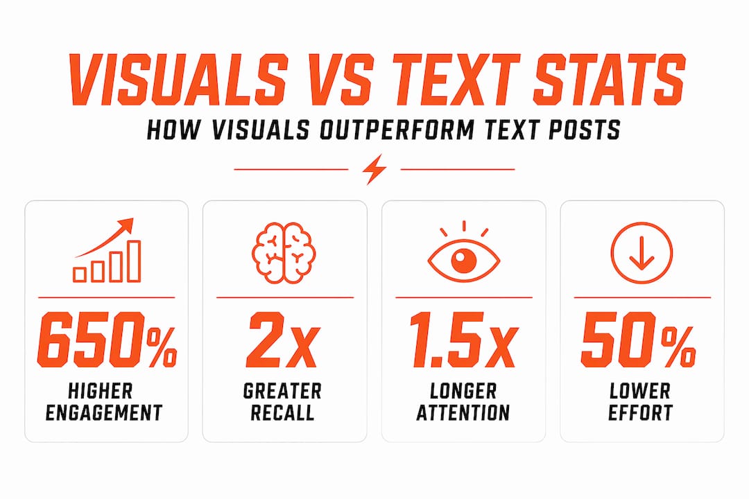
These numbers reflect something text simply cannot replicate: the experiential quality of visual content. A short-form video clip creates a sense of presence. A carousel tells a story with momentum. A static image triggers an emotional response before the viewer has read a single word.
Platform-specific behavior you need to know
Not all visuals perform equally across platforms. Platform format design directly influences engagement, and mismatches between your visual style and the platform's native expectations will hurt your numbers regardless of design quality.
- Instagram rewards visual consistency. Cohesive color palettes, consistent typography, and on-brand aesthetics perform better than one-off graphics that look out of place in a feed.
- TikTok favors momentum and native pacing. Polished, slow-burn content often underperforms raw, fast-paced clips that feel native to the platform.
- LinkedIn responds to editorial clarity. Clean, professional visuals with a clear hierarchy outperform flashy or overly designed graphics that prioritize style over substance.
- X (formerly Twitter) still rewards text-heavy posts in some contexts, but images and graphics consistently drive higher click-through rates than text-only tweets.
Pro Tip: Before designing a graphic, ask yourself which platform it is built for first. A LinkedIn carousel and a TikTok clip require completely different visual logic, pacing, and hierarchy. Designing for "social media" in general is the fastest way to underperform on all of them.
How to balance visuals and text for maximum impact
Understanding the science and the data is only half the job. The other half is applying it without making the common mistakes that cancel out the advantages.
Lead with the visual, support with text
Your visual should carry the primary message. Text should clarify, not repeat. If your graphic already communicates the main point, your caption or body copy should add context, a call to action, or a layer of detail that the image cannot show. Doubling up the same message in both formats wastes the reader's attention and makes the post feel redundant.
Here is a practical framework for building posts that convert:
- Start with the visual concept. What is the single idea this image or graphic needs to communicate? Nail that before you write a word of copy.
- Write your caption at a 6th to 8th grade reading level. Concise writing benefits all literacy levels and increases the proportion of your content that actually gets read.
- Match the format to the message. A product comparison belongs in a carousel or table graphic. A process explanation works better as a short video or step-by-step infographic. A single bold stat deserves a clean, high-contrast static image.
- Optimize for mobile first. Most social media consumption happens on phones. Text that is readable on a desktop may be illegible at mobile scale.
- Add alt text and descriptive captions. These serve accessibility and SEO simultaneously. They also reinforce your message for users who consume content with images turned off or screen readers enabled.
Pro Tip: Treat your visual as a retrieval cue, not just decoration. Images that explicitly represent your core concept improve recall far better than abstract or loosely related graphics. If someone sees your post three days later in their memory, the image should be what brings the message back.
Visual vs. text: when to use which
| Situation | Best format | Why it works |
|---|---|---|
| Announcing a stat or milestone | Static graphic with bold number | Immediate visual impact, easy to share |
| Explaining a multi-step process | Carousel or short video | Sequential format matches the content structure |
| Building brand recognition | Consistent visual series | Repetition reinforces identity over time |
| Sharing a nuanced opinion | Text post with supporting image | Text carries complexity; image provides context |
| Driving event awareness | Video or animated graphic | Motion captures attention in a scrolling feed |
When visuals alone are not enough
Relying entirely on visual content without strategic thought creates its own set of problems. The research is clear that excess or unrelated visuals add cognitive load and reduce effectiveness, particularly for audiences with limited attention or lower visual literacy.
A few patterns to watch for:
- Visual overload. Packing too many elements into a single graphic forces the viewer to work harder to extract meaning. Simplicity almost always outperforms complexity in social media graphics.
- Decorative visuals with no message. Stock photos and generic imagery that do not connect to your core message add visual noise without adding value. They can actually reduce trust by making content feel generic.
- Ignoring audience context. Some audiences, particularly in B2B or technical fields, expect and respond better to detailed written explanations. A well-designed visual supports that text; it does not replace it.
- Skipping analytics. What works for one account or audience segment may not work for another. Testing different formats and measuring actual engagement data is the only way to know what your specific audience responds to.
The goal is not to use more visuals. The goal is to use the right visuals, paired with the right amount of text, on the right platform, for the right audience.
Putting it all together
The advantages of visual storytelling are not theoretical. They are measurable, repeatable, and grounded in how the brain actually works. Visuals communicate faster, stick longer, and generate more engagement across every major platform. Strategic use of format and concise text amplifies those advantages rather than diluting them. And continuous testing based on real audience and platform data is what separates content that performs from content that just gets published.
My take on visuals after years in the field
I have worked with athletic programs and content teams long enough to watch the same mistake repeat itself. Coaches and program directors put enormous effort into writing detailed, thoughtful text posts about their teams, and then wonder why the engagement numbers are flat. The content is good. The format is the problem.
What I have learned is that cognitive science is not a marketing buzzword. It is a practical explanation for why your audience scrolls past text and stops for graphics. The picture superiority effect is real, and once you internalize it, you stop treating visuals as an add-on and start treating them as the primary vehicle for your message.
The insight most people miss is that visuals work best when they are built around a single, clear concept. Not a collage of information. Not a template stuffed with stats. One idea, executed with clarity and purpose. I have seen simple, well-designed graphics outperform elaborate productions because the message was unmistakable at a glance.
My advice: stop asking whether you should use visuals. Start asking whether your visuals are doing enough cognitive work to earn the attention you are asking for.
— Aaron
Take your visual content to the next level
The research is clear, and the engagement data backs it up. But knowing why visuals outperform text is only the starting point. Executing consistently, at a quality that actually moves the needle for your program, is where most teams fall short.
F1rstdown specializes in fully custom social media graphics built specifically for athletic programs. No templates, no generic designs. Every graphic is built around your brand identity, delivered with a one-day turnaround, and backed by a direct relationship with a professional designer. Whether you need a monthly graphics subscription that keeps your feed consistent or you want to explore the full range of custom design services, F1rstdown has the tools and expertise to make your visual content work harder for your program.
FAQ
Why do visuals get more engagement than text posts?
Visuals process faster in the brain and require less cognitive effort to decode than written text. Research shows visual posts generate 650% more engagement than text-only content on social media platforms.
Are images more effective than text for brand recall?
Yes. The picture superiority effect shows that people remember images significantly better than words due to perceptual processing advantages. Visuals encoded through multiple cognitive channels are retrieved more easily than text-based memories.
How does visual content improve retention?
Visuals act as retrieval cues that the brain can access more quickly than text. Pairing a strong image with a concise message creates a dual-channel memory trace, which makes the information easier to recall later.
Does every platform reward visual content the same way?
No. Platform format expectations vary significantly. Instagram rewards visual consistency, TikTok favors native pacing and momentum, and LinkedIn responds to editorial clarity. Mismatching your visual style to the platform reduces performance regardless of design quality.
When should text take priority over visuals?
Text works better when the content requires nuance, complexity, or detailed explanation that a graphic cannot convey. Even then, pairing that text with a supporting image improves comprehension and keeps readers engaged longer.